The Italic Ampersand
 I didn't quite get it right. When I opened the Arts & Life section of the Vancouver Sun this morning I found that in the text they did indeed use the & character. However, in the advertising the ampersand appears in its other form, as a distinct 'et' ligature. I understood that this might be the italic form of the & so I am checking a few fonts for the right shape.
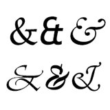
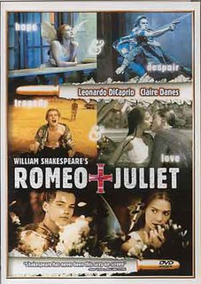
I haven't done an exhaustive search but I did scroll through a few fonts and found that Palatino Linotype does the job! Here it is &. This is the bold italic version of the Palatino Linotype ampersand and shows the et ligature which is found in this movie poster.

Now for a few more images. Six different ampersands appear here. I can see from this that Palationo Linotype is not the font used in the poster. It is close - but not a match.
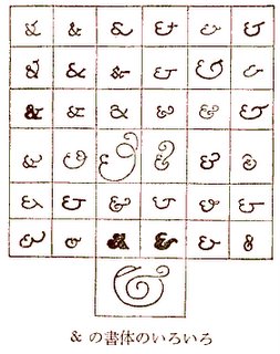
 And the true derivation of the et ligature is demonstrated here. (Actually I am not too sure about this one.)
 An even more wideranging discussion of this character appears here.
I would love to find out what this page in Japanese says about the use of the cross as 'and' in this Romeo + Juliet poster.
Update: Thanks to Emeth Hesed for providing a translation from the Japanese.
What is an ampersand?
Well, let’s take a look at the picture on the left. It is the DVD jacket for Leonardo DiCaprio and Claire Danes’ Romeo & Juliet.
And, because it’s in white it’s hard to see, but can you tell it says “hope & despair, tragedy & love”? Inside the red cross beneath there is a black “&”.
This “&” mark means “and” of course, but why?
Actually, this comes from Latin (a dead language not spoken by anyone anymore). It is a stylish way of writing “et” (meaning “and” in English). As you can see in the chart below, there are various designs.
This mark is called “ampersand.”
A long time ago, when learning the alphabet at school, children memorized it by saying from A, “A-per-se-A, B-per-se-B, ...” (A by itself A, B by itself B). And then, when they finished Z, there was an “&” and they said, “and-per-se-and.” That became “ampersand.” Continue here.

4 Comments:
Hello. I've blogged a translation of the Japanese page you mentioned.
Scrolling rapidly, I thought for a moment you were writing about the Sinhalese writing system and only when I slowed down did I see that it was an ampersand chart.
Just to illustrate this here is Sinhalese.
http://www.omniglot.com/writing/sinhala.htm
Hi Emeth Hesed,
Thanks so much for the translation. It is tantalizing to see some recognisable characters and wonder what is being said.
Post a Comment
<< Home