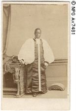
Samuel Ajayi Crowther
 I don't often comment on the many new writing systems featured on Simon's Omniglot site. I read his website regularly and take its immense popularity for granted.
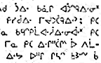
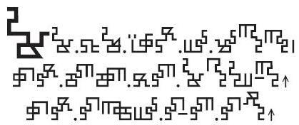
However, this one time I feel the need to expand on a reference. Once in a while I read a name or word that stirs deep memories. This is a story that must be told. On the new page for Igbo I find,
"The first book in Igbo, Isoama-Ibo, a primer, was produced in 1857 by Samuel Ajayi Crowther, an ex-slave and teacher. "
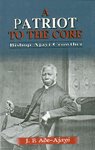
Here is the recently published biography of Ajayi Crowther. A Patriot to the Core: Bishop Ajayi Crowther by J.F. Ade-Ajayi, 2002, Spectrum Books, Nigeria.
Many short versions of his life can be found on the internet. From Great Christians in History;
"Samuel Crowther (about 1806-91) was the outstanding African Christian leader of his time. Adjai (properly Ajayi) was born in the Egba group of the Yoruba people in what is now Nigeria. When he was about 15, he was captured by slave raiders. But the slave ship was intercepted by a British warship, and Adjai was taken to Sierra Leone where he was converted and baptized, taking the name
 Samuel Crowther. Outstanding at school (and a foundation pupil of Fourah Bay College) Crowther became a teacher for the Church Missionary Society, ...
He "became convinced that the evangelization of inland Africa must be carried out by Africans. Ordained in London in 1843, he was appointed to the new mission in his own Yorubaland. ... Crowther achieved much as evangelist, translator and negotiator. He impressed many, including Queen Victoria, when he visited England. He led the new Niger Mission in 1857 and in 1864 became the first African anglican bishop."
There are several accounts of Samuel Crowther on the internet and most of them end here. This, unfortunately, is a great disservice to history. The truth is that during Crowther's years as bishop, policy and personnel in England changed, and from the time of Crowther's death in 1891 until 1952 there was no other African bishop in the Anglican Church.
This article from Christianity Today represents the story as I remember it. From the last few paragraphs;
"Venn's replacement further undercut Crowther's authority by handing control of the Niger Mission's "temporalities" to a committee in 1879, following it the next year by appointing a Commission of Inquiry into allegations of misconduct by Crowther's subordinates...
All but three of the Niger Mission's 15 Africans were fired. When Crowther protested, he was charged with violating his code of office. He died shortly thereafter, and a white bishop was put in his place. The continent would not see another African Anglican bishop until 1952, sixty years after Crowther's death."
 I read Ade Ajayi's book Christian Missions in Nigeria many years ago and it left a powerful and lasting impression.
Ade-Ajayi J.F. Christian Missions in Nigeria: the Making of a New Elite. 1965. Longmans. London.
Ade-Ajayi J.F. A Patriot to the Core: Bishop Ajayi Crowther. 2002. Spectrum Books. Nigeria.
posted by Suzanne McCarthy at 3:55 PM
1 comments
![]()
![]()


